AARRR: Getting the most out of pirate metrics
Silicon Valley veteran Dave McClure originally coined the term pirate metrics on account of how the acronym sounds when you say it aloud.
"Aaaaaarrrrrrgh!" – Dave McClure, 2007
Since reading about them in Croll and Yoskovitz’s Lean Analytics in 2013, the framework has always been close to the top of my kitbag and time and again proved one of the first tools that I would roll out when getting acquainted with a new product.
So what is it?
Calling it a framework may be over-selling it, or at the very least make it sound more complex and less accessible than it actually is. At its core, it is a simple way to model your proposition, identify key candidate metrics and - crucially - keep you focused on the things that matter.
The five areas to focus on are:
- Acquisition - How to get users to your product
- Activation - How to get users to make that first key interaction
- Retention - How to get users to return to your product
- Revenue - How to monetise your proposition
- Referral - How to get users to tell others about your product
How is it applied?
Croll and Yoskovitz did a great job of serving up examples of how the framework can be applied to different industries, helping me map services and define metrics at organisations such as national broadcaster BBC, automotive retail unicorn cinch, and the UK government’s Department for Transport.
Post-it notes and a wall, a whiteboard, or Miro will do the trick here. In my experience, rather than attempting to do this collaboratively from scratch, it’s best to come up with a straw-man on your own or perhaps in a pair, then play it back to a wider audience and tinker as you go.
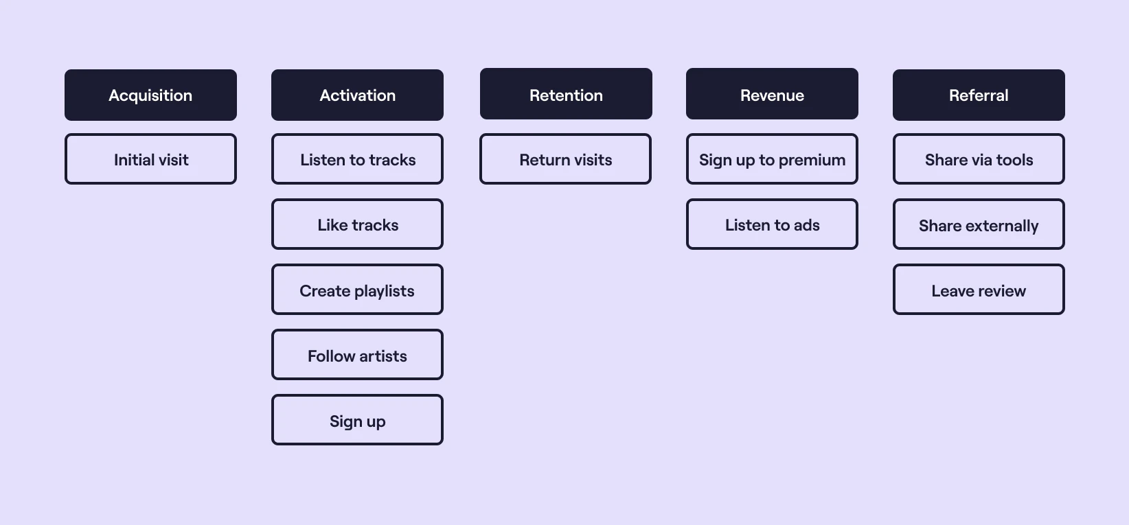
I’ve created a high-level model of Spotify below as a relatable example to illustrate a few points. As ever, a few caveats apply - it’s not as granular as it could be (and undoubtedly would be in reality) e.g. further broken down by capability, by device, by channel, and it focuses purely on consumers rather than artists, who themselves could probably have their own model and associated metrics.

It shows the core user activities laid across the five pirate metrics areas in a linear fashion in an attempt to make it easy to understand at a glance. The activities have been given a plain English title, mostly using the verb / noun approach, again in an attempt to boost accessibility.
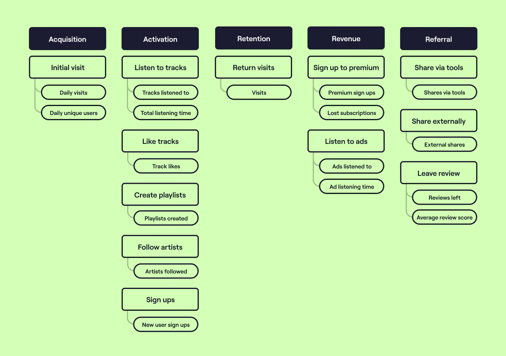
Assuming you’re happy with the presentation, level of detail, and terminology used in your model, you can then begin to layer on metrics.
There is a broad spectrum of opinion when it comes to how best to frame and calculate metrics, and no shortage of literature on the web. What I would say here is don’t feel obliged to match any one prescription. Many factors can influence how you choose to shape them, such as the capabilities of your product, how it is utilised (particularly if there is a time element to the metric), your organisational culture, and of course your personal preference borne from your own experience.
A few rules that have served me well when defining metrics throughout my career:
- Ensure that they are comparative. Numbers that just go up are no use at all. Rates and ratios have always served me well.
- Make them as plain English as you can. Leave the jargon at home if at all possible.
- Can your organisation - better still your product engineering teams - influence them? If you can’t think of an obvious way, it may not be worth measuring them.

I've left out the calculation and time element of the metrics in an attempt to make the illustration more consumable, but make no mistake - this level of detail is integral. Whenever communicating the metrics or model it is always prudent to include the lower level definition alongside to minimise uncertainty and misunderstanding - bringing us on neatly to the next step: defining and documenting.
The table below shows what this might look like, with an example for each of the five areas:
| Category | Title | Example value | Definition | Source |
|---|---|---|---|---|
| Acquisition | Daily unique users | 1,023 daily unique users | The total number of unique users (i.e. browsers) to any page of the site / app | Google analytics |
| Activation | New user sign ups | 0.14 sign ups per user per week | The total number of new sign ups in a week divided by the total number of unique users in a week | Google Analytics / Snowflake |
| Retention | Visits per week per user | 7.43 visits per week per user | The total number of visits in a week divided by the total number of unique visitors in a week | Google Analytics |
| Revenue | Premium sign ups | 0.08 premium sign ups per user per week | The total number of new premium sign ups in a week divided by the total number of unique users in a week | Google Analytics / Snowflake |
| Referral | Average review score | 4.42 out of 5 | The average score left on Trustpilot across all users in a week | Trustpilot |
The two artefacts above and the process you’ll have gone through to bottom each of them out will give you an excellent platform to move on to the next step.
What matters most? ⚖️
The real challenge begins when you start to try and move the needle, but which needle?
Whilst the modelling and definition exercise is hugely beneficial and you will want to measure and regularly review all of these metrics, it undoubtedly serves up more than you’ll be able to focus a whole organisation on, let alone one team.
Before attempting to combine and distil the dozen-plus metrics you have in front of you, it’s a good idea to spend some time getting familiar with them. Like a pair of shoes - you often only find out they don’t fit after you’ve worn them for a few days. Don’t be afraid to go back to the drawing board and rework your model and definitions - I’ve never stuck with the first iteration I’ve come up with. Questions to ask yourself may include:
- Is this metric easy to understand at face value?
- What factors influence this metric? Traffic mix? Seasonality?
- How does this metric relate to others?
- What is the benchmark for this metric?
- Is there a better way to calculate or define this metric?
- Is this the best timeframe for this metric?
- Is this the best data source for this metric?
- Is this the best unit and granularity for this metric?
By permitting yourself some contemplation time, you’ll no doubt have combined or consolidated what you had come up with, and will have developed an initial feel for what your likely priorities will be which will put you in a good position for the final step: weaponising your metrics.
The key here is to hypothesise what the relationship is between the metrics that you’ve identified so far, and then model this out. You won’t get this right the first time, and that’s okay. It can be very difficult - sometimes impossible - to establish a clear link between each of your metrics, but you have to start somewhere. Analysing historical trends can help, as can segmenting your user data and poring over user research insights.
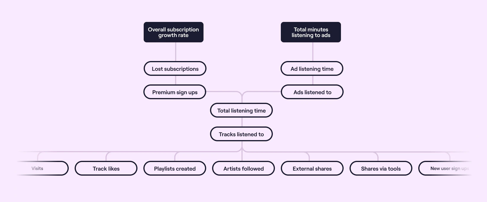
This exercise will likely reveal one or more grander metrics that you may not have initially had on your model, and the aim is to build up a hierarchy of how you think each of your metrics may impact others. Here’s where I got to based on the Spotify model and metrics, revealing a couple of broad, strategic measures that hadn’t previously been called out.

At once, it gives us a couple of key metrics that we can all get behind and pushes a lot of the metrics we identified into the background to enable us to focus on a smaller set that we believe will likely yield the biggest impact.
The magic really happens when you start using these in anger. Now you have something to hang your hat (or more accurately the key results that will move you towards your objectives) on, which in turn will enable you to ideate and experiment around one or more of the measures and build up a bank of evidence regarding their relationship to one another, inevitably resulting in you tweaking the three artefacts above, and refining your aims as you go.
How does it fit with other approaches?
As already hinted at, identifying your pirate metrics using the approach outlined above can give you a great platform to layer OKRs on top of. The models provide a framework as well as a common language to help you identify both objectives and key results, to hypothesise how targeting more granular metrics can impact those higher up, and crucially provide you with the tools to measure progress.
There are also parallels with Amplitude’s North Star Framework, and the various templates and workshops described in their playbook are particularly helpful when trying to turn the sea of metrics that McClure’s approach often generates into a smaller, punchier, hierarchical set of measures that really matter.
In summary
Pirate metrics are a great way to get to know your product, to understand the high value (and not so high value) interactions that your users have with it, and to outline the goals of your team or wider organisation and measure progress towards them. The artefacts that you’ll generate as a result of the process are great reference points that will serve your team well for some time, and also provide a healthy dose of context for any new joiners or those not so familiar with your domain.

